Case Study 04 · Widget
Designing a widget that refused to become a dashboard
A five-level data hierarchy squeezed onto a glanceable desktop widget for building managers and energy analysts. I killed the first direction that looked right, and shipped the one that answers before it explains.
- Client
- Confidential, KPMG engagement
- Role
- Service & Product Designer
- Timeline
- KPMG · 2016 – 2020
- Platform
- Desktop widget (macOS)
The constraint
A widget that refused to become a dashboard
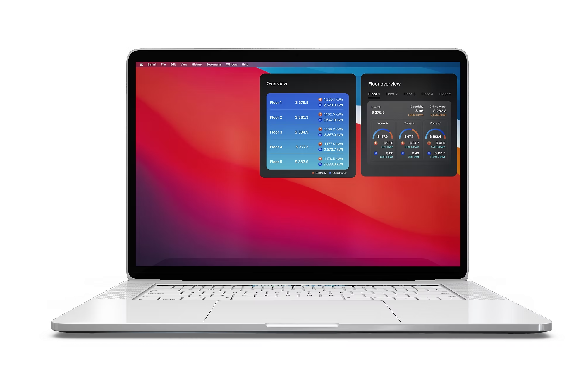
This widget lives on a building manager's desktop, between a spreadsheet and an email client. Nobody opens it to run an analysis. They glance at it for two seconds while thinking about something else, and it either tells them what they need or it's dead weight taking up screen space.
That constraint, not the charts, not the colour palette, is what this project was actually about.
Delivered as a KPMG service design engagement. The end client is withheld here under NDA.
Two people, one surface
One surface, two very different needs
Two people rely on this surface. A building manager wants a fast read on whether anything looks off today. An energy analyst wants to go one or two levels deeper: which floor, which zone, which system is driving the number, without opening a separate reporting tool.
Same widget. Very different depth of need. That tension runs through every decision below.
The real problem
Five levels of data. Two seconds of attention.
Underneath "show energy consumption" is a five-level hierarchy: building, floor, zone, utility (electricity or chilled water), category (mechanical, lighting, general power, workstation).
A dashboard can absorb that kind of depth. It has a full browser tab and a user who came to dig. A widget doesn't get either of those things. It gets a few hundred pixels and a few seconds of attention, on every visit.
“The real design problem wasn't how to visualise this data. Plenty of chart types can do that. It was deciding how much of a five-level hierarchy a glance-and-move-on surface is allowed to show before it stops being a widget and starts being a dashboard wearing a widget's clothes.”
Every early direction got this wrong in the same way. It tried to be complete instead of being fast.
What got killed
The direction that looked right and answered the wrong question
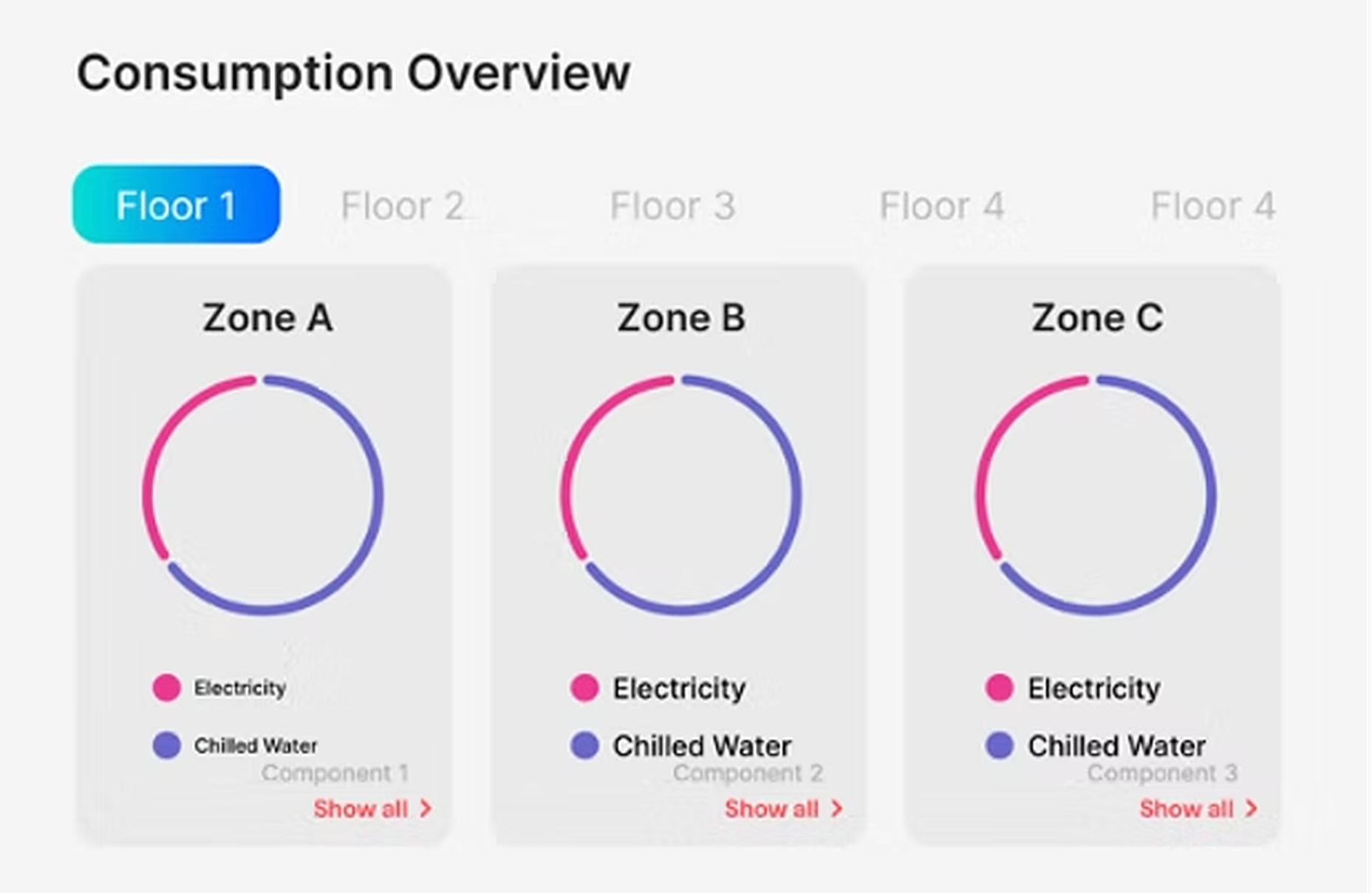
The first real design direction used a donut ring per zone, split between electricity and chilled water. It looked clean, it looked modern, and it was wrong for the job.
A ring shows proportion: what share of consumption is electricity versus chilled water. It doesn't show magnitude: how much this zone is actually costing, and whether that's high or normal. Someone glancing at three rings side by side can tell the mix looks similar across zones. They can't tell which zone to worry about. For a surface whose entire value proposition is "tell me fast if something's wrong," that's the wrong answer to lead with.
This is the direction that needed to be killed, not iterated on. A prettier ring is still a ring.
The pivot
Answer first, explain second
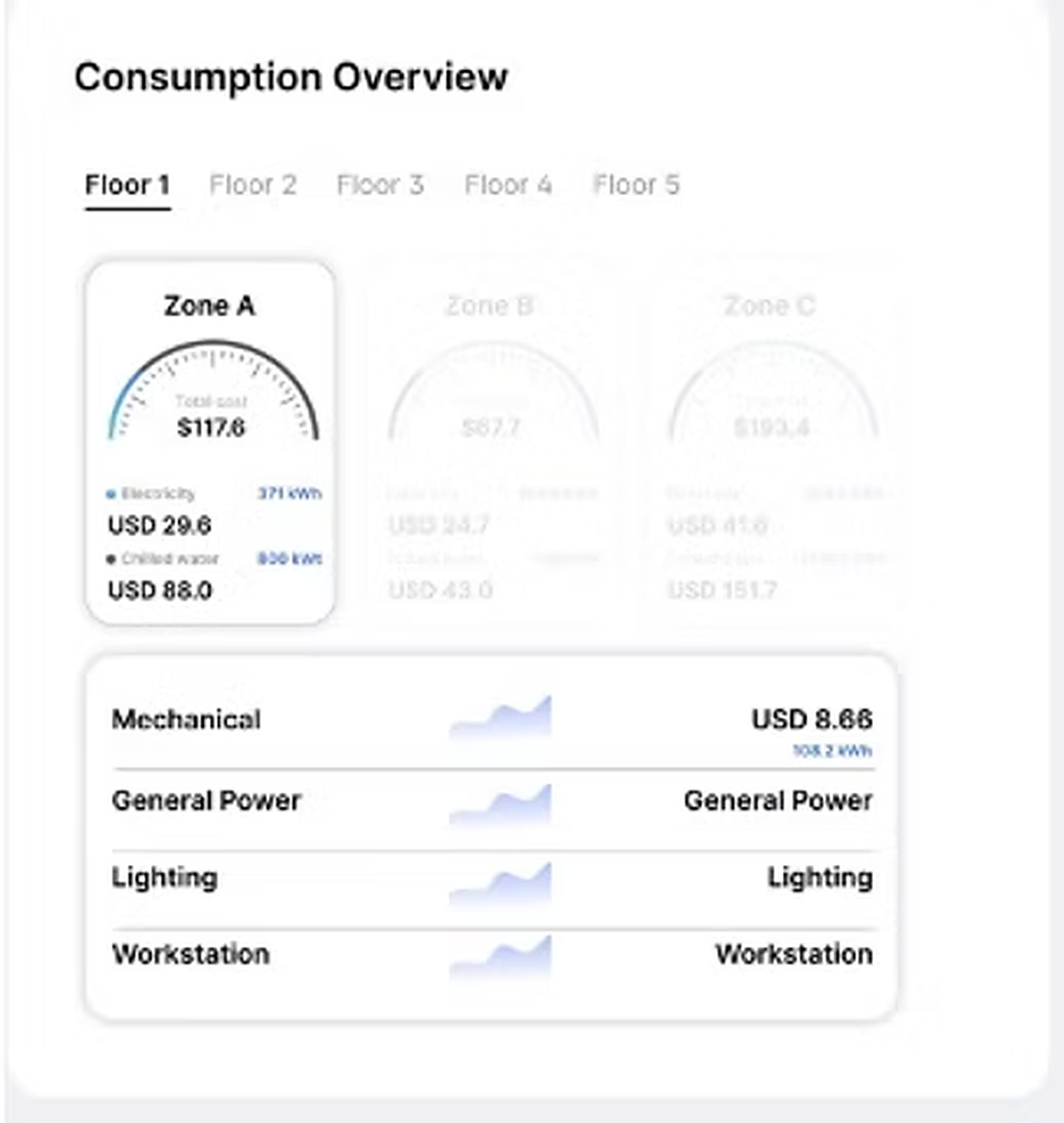
The fix was to invert what the visualisation leads with. Instead of a ratio, the centre of the design is a single number: total cost for that zone. The electricity/chilled-water split didn't disappear, it moved to colour along the arc, secondary to the number, present but not competing with it.
Same underlying data as the ring. A completely different question being answered. The ring asked what's the mix. The gauge asks is this a number I need to think about, and only then offers the mix, for the person who wants to know why.
“A glanceable surface has to answer before it explains. Every other decision in the widget, the layout, the depth of drill-down, the visual weight of secondary data, follows from that one rule.”
Building the hierarchy
Three stacked answers, each complete on its own
The gauge decision set the pattern for the rest of the hierarchy. Instead of one screen trying to hold building, floor, zone and category all at once, the widget became three stacked views, each answering one question completely.
Overview
Every floor, ranked by cost, at a glance.
Answers: is anything unusual across the whole building?
Floor
That floor's zones as gauges, side by side.
Answers: which zone is driving it?
Zone
Category breakdown (mechanical, lighting, general power, workstation) with a trend line.
Answers: why, and is it getting worse?
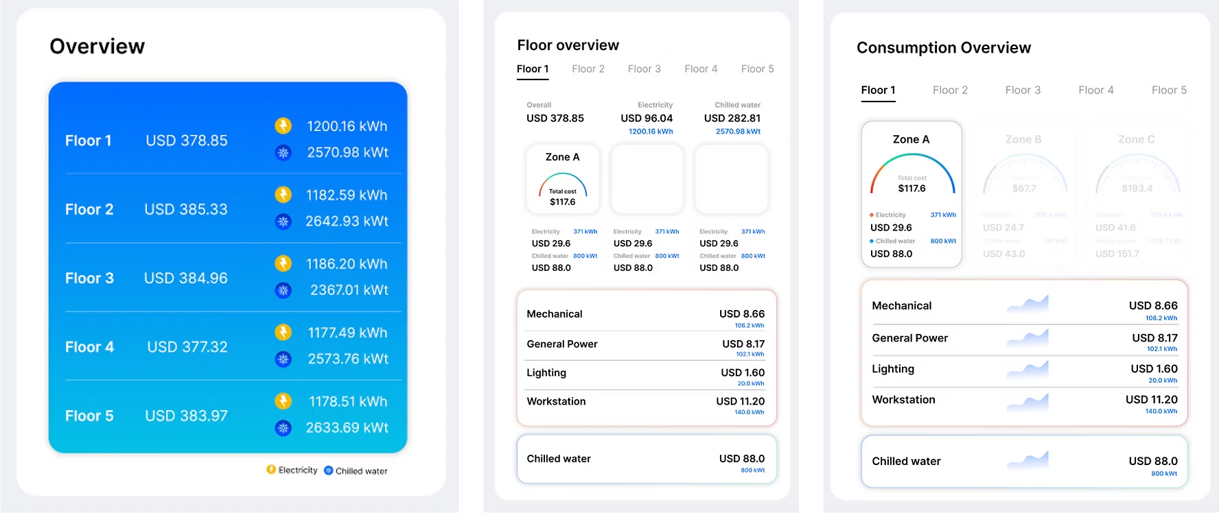
Nobody is required to go past level one. The person who only ever looks at Overview still gets a complete, useful surface. Depth is optional, not owed, which is the opposite of how most internal tools get designed, where every screen tries to justify its existence by cramming in one more metric.
Making it survive the desktop
Designing for a surface with no frame of its own
The earliest high-fidelity pass used a light, card-based UI. Clean in isolation, but it assumed the widget lived inside a product frame with its own background. It doesn't. It sits directly on a desktop, over whatever wallpaper is behind it, permanently.
That's the actual reason the final version moved to a dark, glass-like surface with translucency, not as a style refresh, but because a widget that has to survive being layered over any wallpaper needs to recede rather than compete with it. Icons for electricity (bolt) and chilled water (snowflake) replaced text labels wherever they'd otherwise repeat, so the surface reads at a glance without requiring anyone to read a legend first.
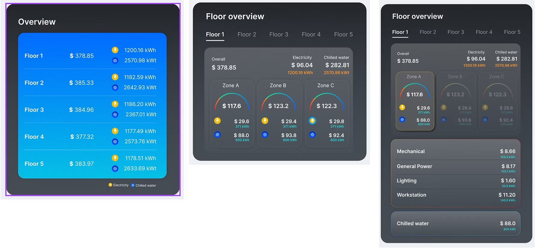
This is where "glanceable" stopped being a principle and became a rendering decision.
Validating the calls
Two decisions, tested directly
Testing with building managers and energy analysts was run specifically to check the two decisions above, not as a general usability pass. The findings here are qualitative, from moderated sessions, not a quantitative readout.
- Gauge over ring. Shown side by side, testers consistently anchored on the gauge first. The single number gave them something to react to immediately, where the ring left them looking for a number that wasn't there.
- Drill-down over density. The three-level path (Overview, Floor, Zone) was preferred over showing category-level detail up front for every zone. Testers wanted the option to go deeper, not the obligation to read through it every time.
Looking back
Honest about the gap
The widget went live. That's a real outcome, and I'm not going to dress it up as more than it is: no adoption or usage data was ever collected after launch, because no instrumentation plan existed to collect it. It shipped, and then the loop closed with silence.
That's the honest gap in this project, and it's the lesson I took from it: for a persistent, ambient surface like this, defining what "working" looks like, and how you'd measure it, is part of the design brief, not a follow-up task for after launch. I'd build that in before the first pixel next time, not after the last one.
The design decision I'd stand behind without reservation is the gauge-over-ring pivot. Everything about the rest of the system, the drill-down depth, the dark surface, the icon language, exists to protect that one idea: a widget has to answer before it explains.