Case Study 01 · TallyMoney
Fixing the funnel for a radical new kind of money
68% onboarding drop-off. Three user cohorts. One redesign that changed how the product acquired customers, built as the sole designer from an MVP-only starting point.
- Role
- Product Designer (Solo)
- Timeline
- Jul 2023 – Present
- Platform
- iOS · Android · Web App
- Tools
- Figma · Amplitude · GA · Jira
The starting point
A product with a radical premise and a broken front door
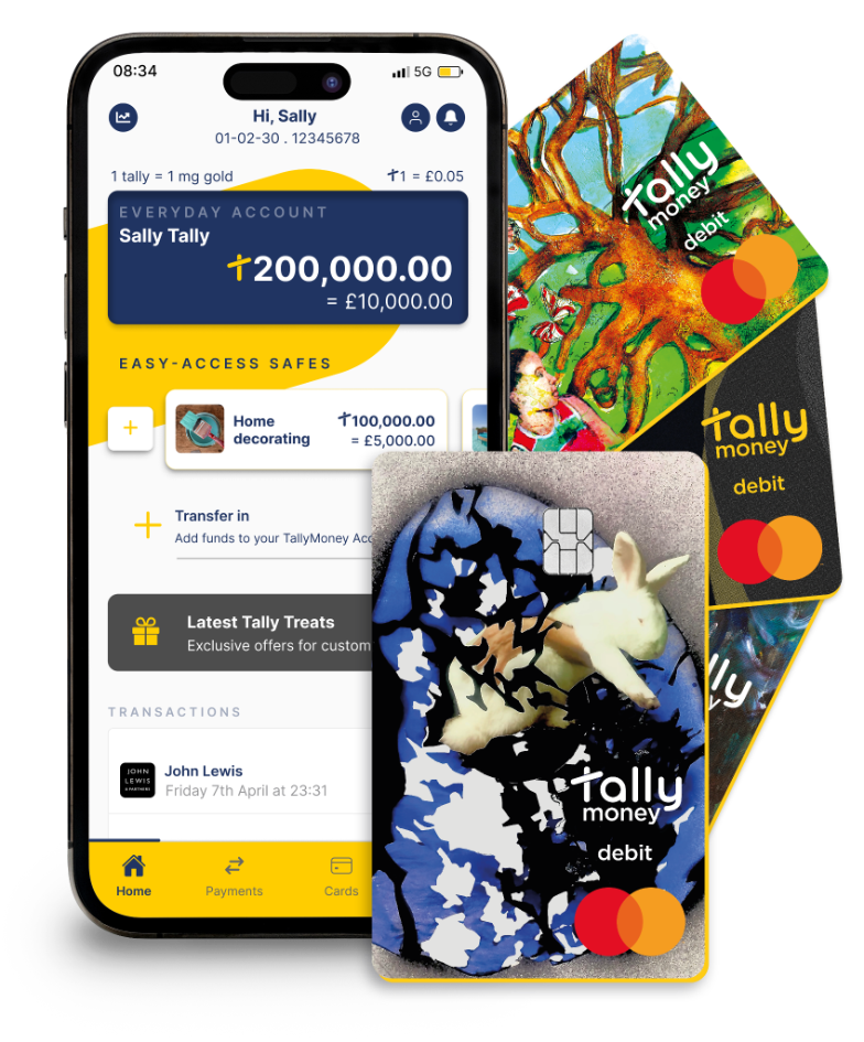
TallyMoney is a radically different kind of money: gold-backed, with every balance held as physical gold in Swiss vaults. One tally equals one milligram of LBMA-accredited gold.
But the product had a broken front door. 68% of users arriving from organic traffic were dropping out before completing account creation.
I joined as the sole designer, with no design system, no research practice, and no defined process to build on.
The broken door
Three compounding problems, one broken journey
The drop-off wasn't one failure. It cascaded across three stages of the journey, each compounding the last.
The comprehension barrier
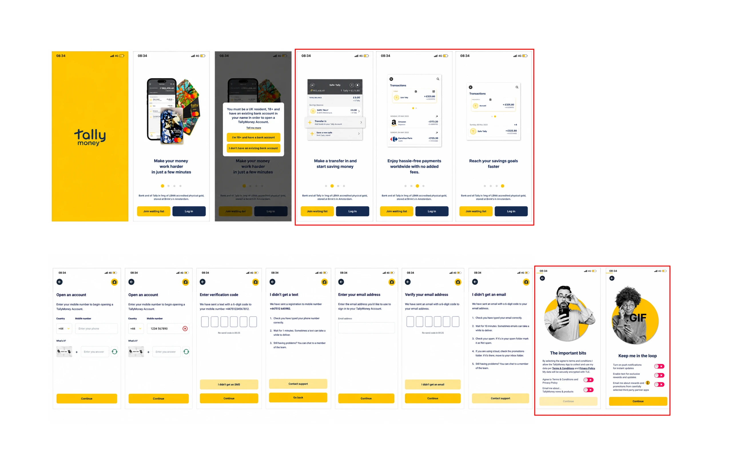
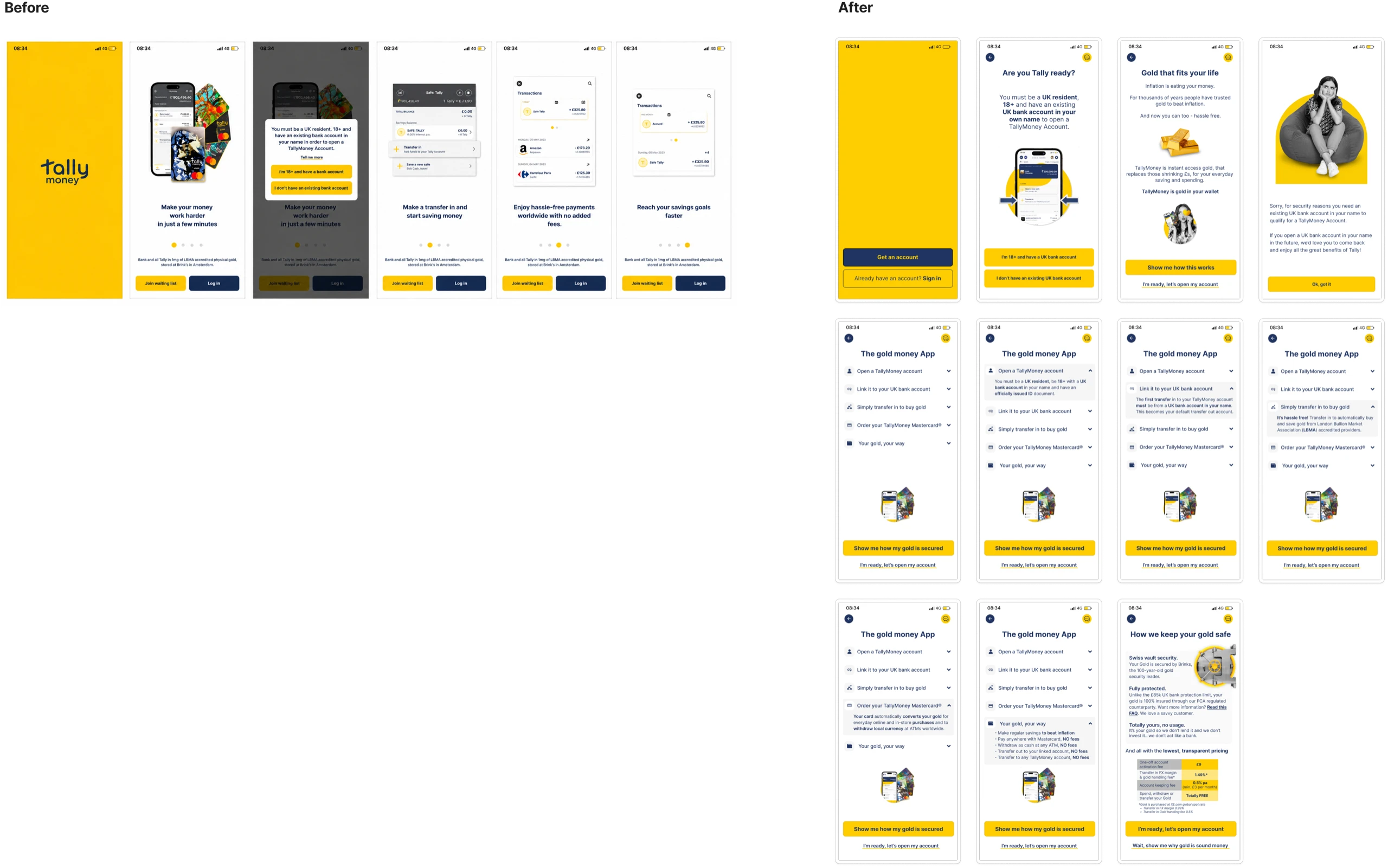
Organic users landed on a generic GIF carousel, "Supercharge your savings in minutes" and a button, with no education and nothing to build trust.
CAPTCHA on screen one
The very first action screen demanded a CAPTCHA and a phone number, before any value or trust had been established.
Journey fragmentation
Website → app download → account creation → KYC → submission felt disconnected. T&Cs appeared too early, and there was no sense of progress.
“The old flow asked for trust before earning it. Every screen demanded something from the user: data, agreement, patience, all before giving them any reason to continue.”
All about the users
Understanding who was arriving, before designing anything
Before designing anything, I needed the qualitative "why" behind the numbers.
I embedded with the customer-facing team and found three distinct audiences arriving at the same broken door.
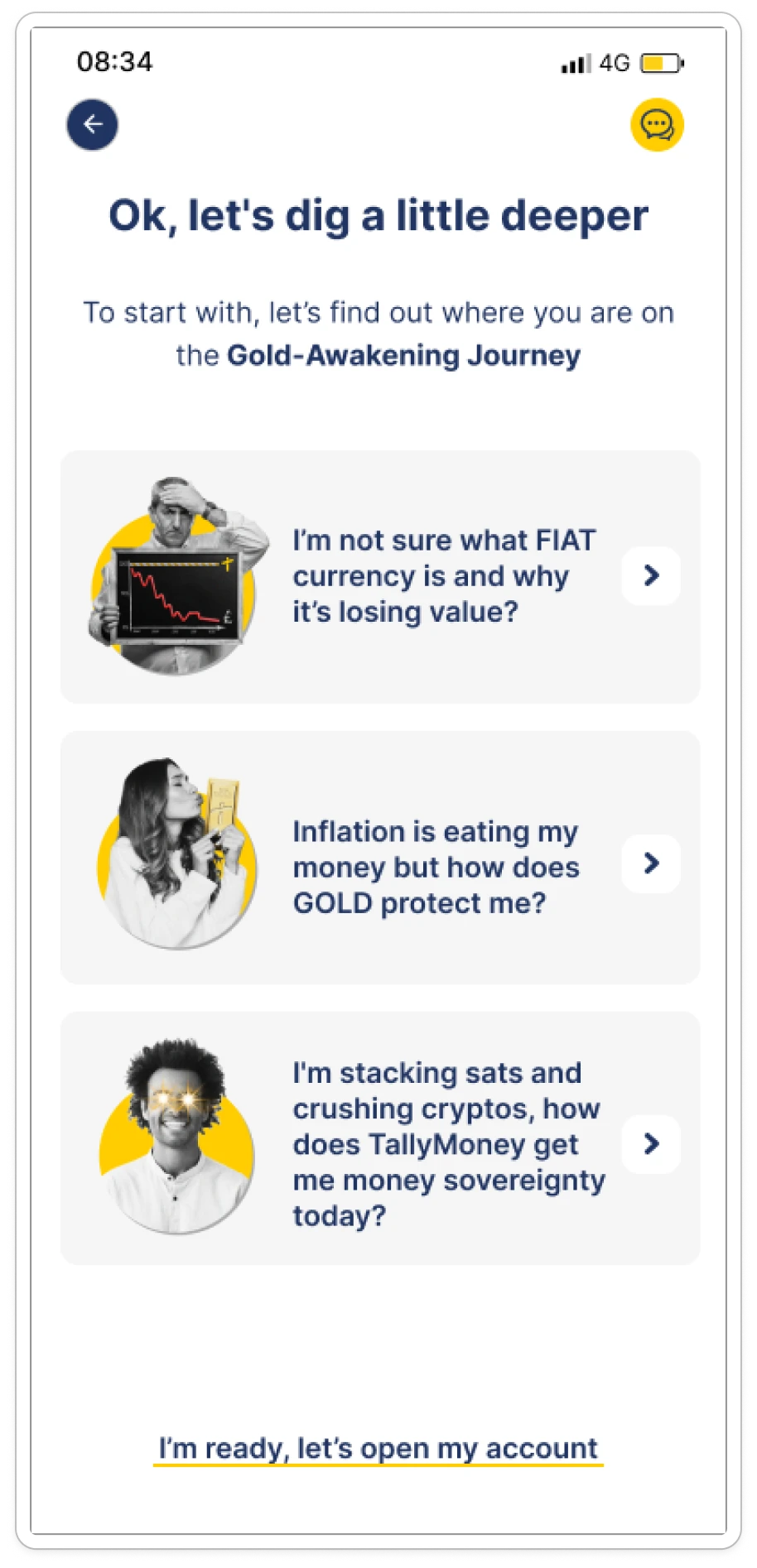
The Mainstream Saver
Needs the most education before anything else.
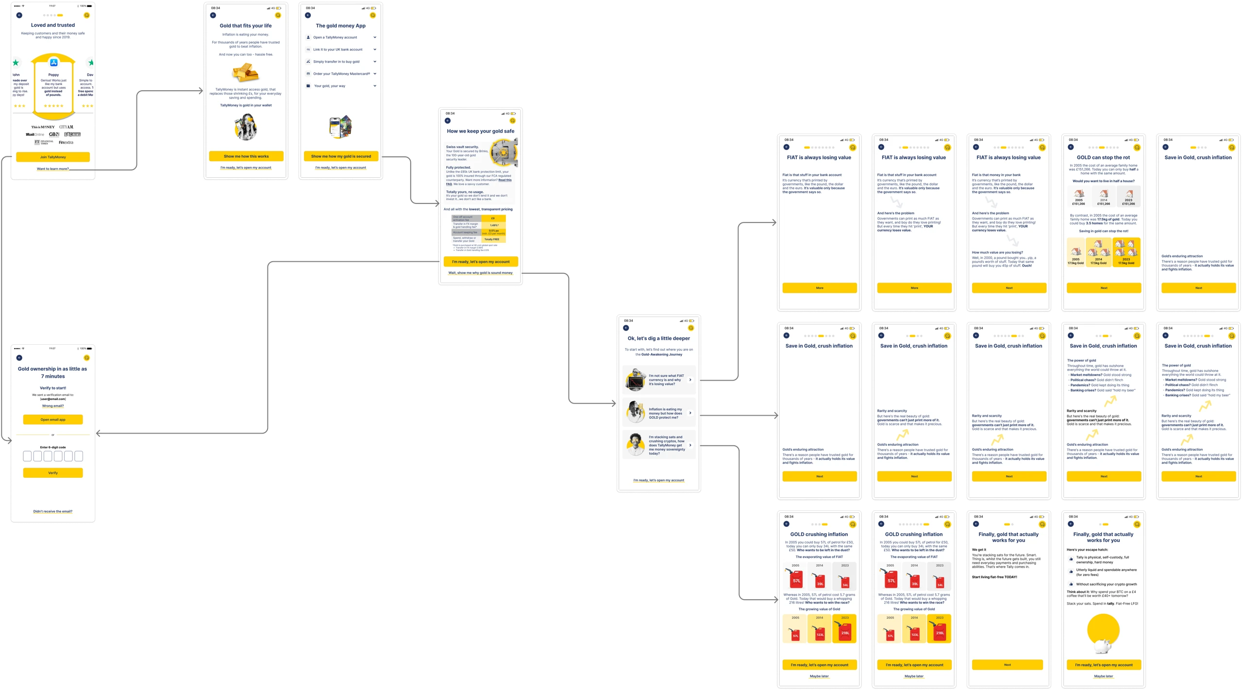
“I'm not sure what FIAT currency is”
The Gold-Curious
Needs education plus social proof.
“Inflation is eating my money. But how does gold protect me?”
The Gold-Aware
Crypto-native. No education needed, just a fast path.
“I'm stacking sats. How does TallyMoney get me money sovereignty?”
A fourth group was already ready to sign up, so they needed an "I'm ready, let's open my account" escape hatch straight through the flow.
The turning points
Five decisions that changed everything
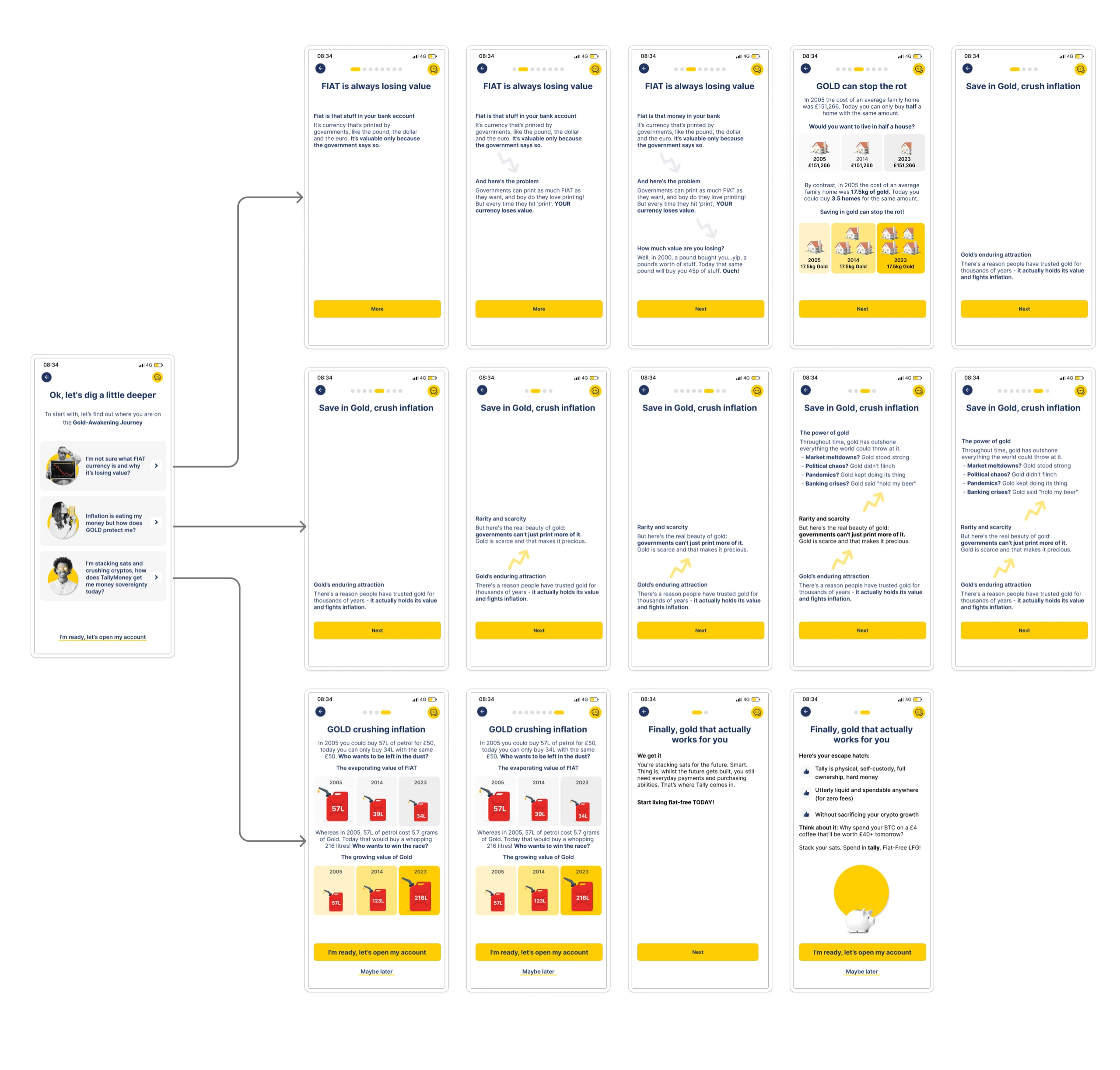
Education before registration
The single biggest lever: teach before asking. Organic users met tailored education that explained gold-backed money before any form appeared.
↑ Directly addressed the 68% drop-off root cause
Self-selection as the UX mechanism
Rather than guess what each visitor already knew, the flow let users self-select their starting point, and that choice routed them to the right depth of education.
↑ Validated via A/B test across 3 cohorts
Social proof as a trust bridge
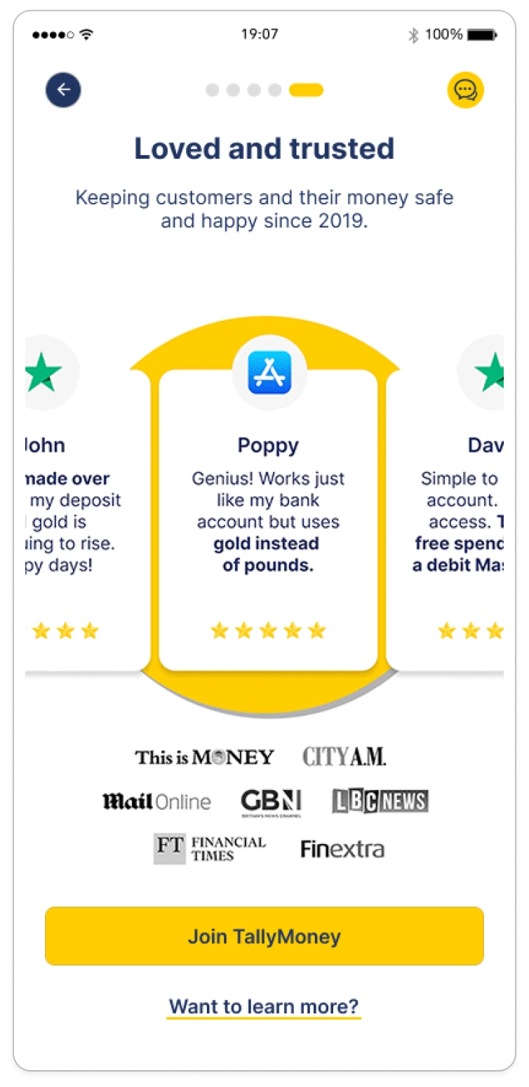
A "Loved and Trusted" screen surfaced press coverage: FT, City AM, Mail Online, GBN, before any commitment was requested.
↑ Trust established before commitment was requested
Progress visibility and momentum throughout
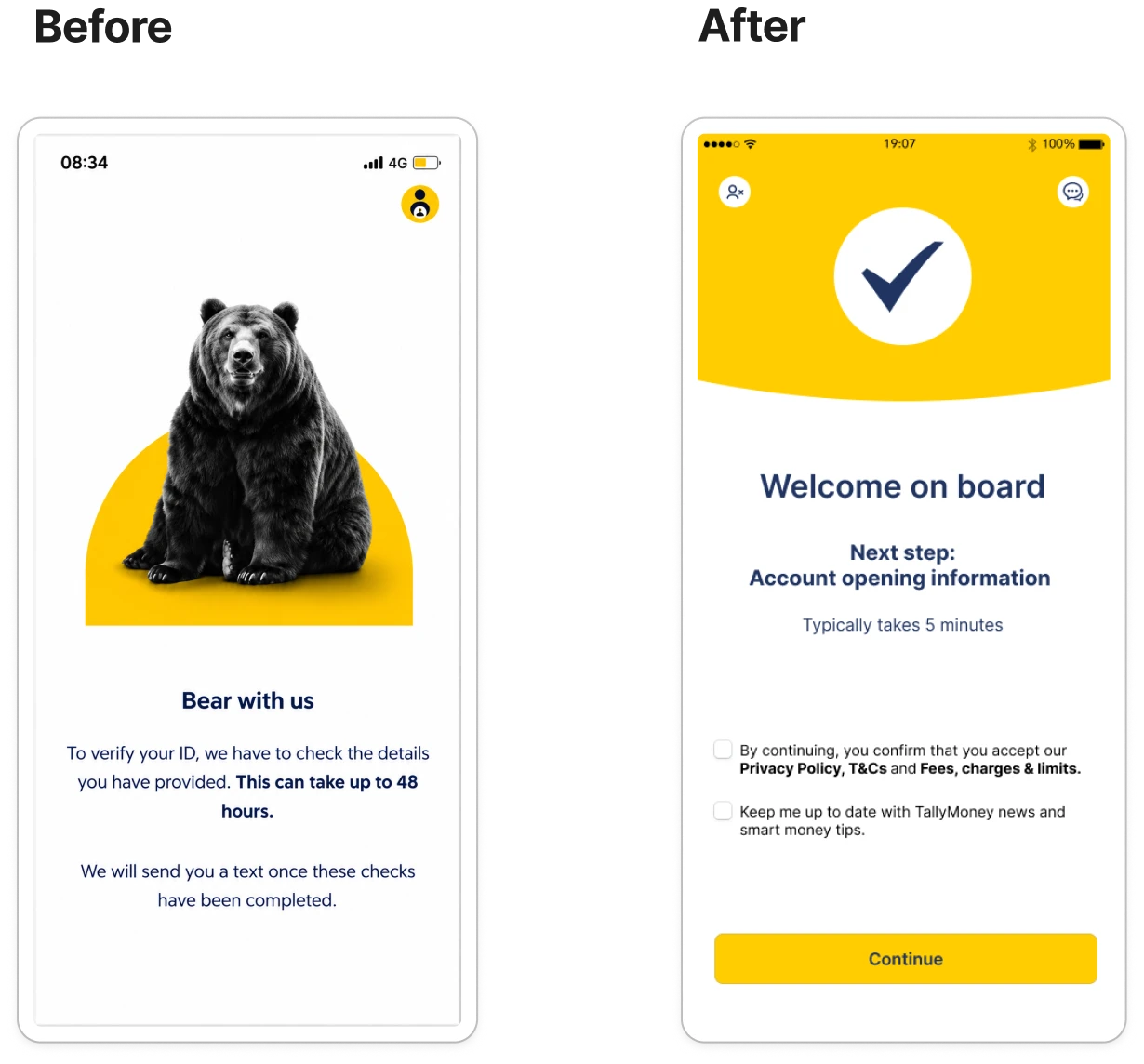
Step-dot indicators and reassuring copy, "Welcome on board · Next step: Account opening information · Typically takes 5 minutes," replaced the old "Bear with us, 48 hours."
↑ Reduced perceived effort and abandonment at final steps
Inline error recovery, not dead ends
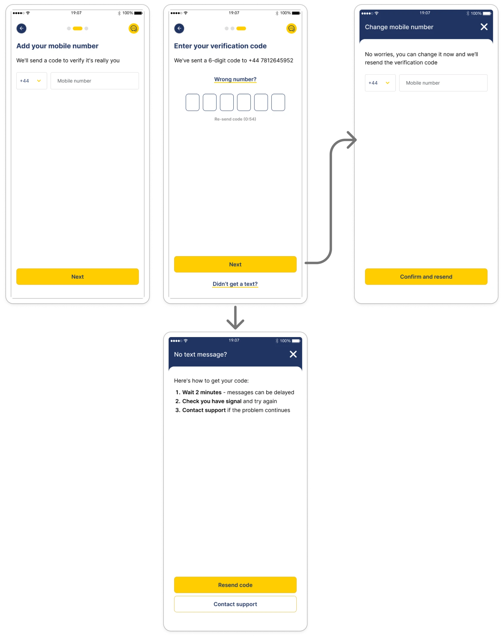
"Wrong email?" / "Wrong number?" bottom-sheet modals with a "Confirm and resend" action replaced dead-end screens.
↑ Eliminated dead ends that caused flow abandonment
The transformation
The journey, transformed
The redesign resequenced the entire journey: trust, then value, then data, then commitment.
Old flow
- GIF carousel with no explanation
- CAPTCHA on the first screen
- Phone → OTP → email → OTP double verification
- T&Cs presented before any value
- Marketing consent bundled with T&Cs
- 4-digit PIN only
- No progress indicators
- "Great things come to those who wait" mid-flow
- "Bear with us, 48 hours" closing screen
- No inline error recovery
Redesigned flow
- Gold-Awakening segmentation up front
- Tailored education per cohort
- "Loved and Trusted" social proof
- Email-first, then mobile
- T&Cs moved to "Welcome on board"
- Marketing consent separated and optional
- Full password with real-time validation
- Face ID prompt
- Step indicators throughout
- "Next step: Account opening · Typically 5 minutes"
- Inline "Wrong email?" / "Wrong number?" recovery
What moved
What the redesign actually moved
Drop-off reduction from organic traffic
Funnel analysis confirmed the lift, driven by education-first onboarding and cohort segmentation.
Data-validated design decisions
A/B testing across three cohorts proved the segmentation approach.
Design foundation for scale
The work set the pattern for Homepage, Payments, Open Banking, Dormant accounts, Capital Gains, Cards and the Web App, and the design team scaled from 1 to 6.
Improved security UX
A 4-digit PIN gave way to a full password plus Face ID.
Multi-platform consistency
A shared design system spanned iOS, Android and the Web App, with seamless web-to-mobile continuation.
Looking back
What I'd do differently
The CAPTCHA was a legal and fraud constraint, but I'd push harder for bot prevention that doesn't signal distrust to first-time users.
I'd build the design system from day one rather than retrofitting it once the team grew.
And I'd fight earlier for cohort-level qualitative interviews instead of inferring the "why" second-hand.