Case Study 03 · Monki
Ten friction points. Five revenue risks. One research brief that moved the needle.
A moderated usability test of Monki.com for a client, 5 recruited participants, 4 tasks, benchmarked head-to-head against PrettyLittleThing across 8 metrics, delivered as a prioritised roadmap. Five of ten recommendations were implemented.
- Client
- Monki (via agency)
- Role
- Solo UX Researcher & Designer
- Study
- Dec 2022 · 4 tasks × 2 platforms
- Participants
- 5 recruited · moderated · think-aloud
- Methods
- A/B Usability Testing · SUS · NPS · CSAT · Paired T-Test · Card Sorting · Accessibility Audit
The short version
Four lines, the whole story
- A client-commissioned, moderated usability test of Monki.com: benchmarked task-for-task against PrettyLittleThing.
- 5 recruited participants ran 4 realistic shopping tasks on both sites, measured across 8 metrics.
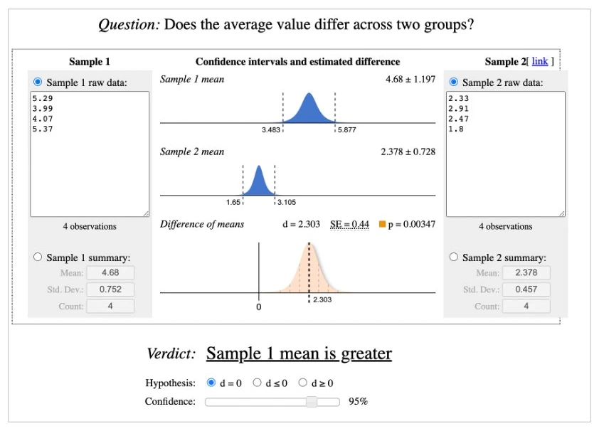
- Monki landed in the SUS Poor band with most tasks failed. The gap was statistically significant, not opinion.
- Findings became a prioritised, costed roadmap: five high-priority recommendations shipped.
The question
Is Monki.com as usable as it is beautiful?
Monki: a Scandinavian fast-fashion brand for women 19–38, loved for its look. In 2022, through an agency commission, I was asked to find out whether the website deserved the same reputation.
- Benchmark Monki.com head-to-head against a leading competitor (PrettyLittleThing).
- Locate the friction driving abandonment, with evidence the product team can't dismiss.
- Deliver a prioritised roadmap, not a report that sits in a drawer.
How it was run
4 tasks · 5 participants · 2 platforms · 8 metrics
Recruit
5 participants matching Monki's 19–38 target, screened on shopping habits.
Pilot twice
Expert + novice pilot runs. Expert time ×5 set each task's novice time budget.
Moderated sessions
Think-aloud protocol, audio + screen recorded. Every task run on both sites.
Post-test instruments
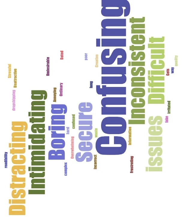
SUS, CSAT, NPS, confidence rating and a desirability word-choice exercise.
Analysis
Paired t-test on task times. Every issue severity-graded and tied to a business risk.
| Task given to participants | Expert pilot | ×5 budget |
|---|---|---|
| 1 · "Create an account, add a red dress to the cart, check its reviews" | 60 s | 5:00 |
| 2 · "Find the Black Flowy wide-leg trousers, apply a student discount" | 93 s | 7:45 |
| 3 · "Find winter boots, then the nearest store to buy them in person" | 78 s | 6:30 |
| 4 · "Check the fit guide for an overcoat, then find the refund policy" | 120 s | 10:00 |
The four tasks, verbatim, with time budgets derived from the expert pilot (Common Industry Format).
Who was tested
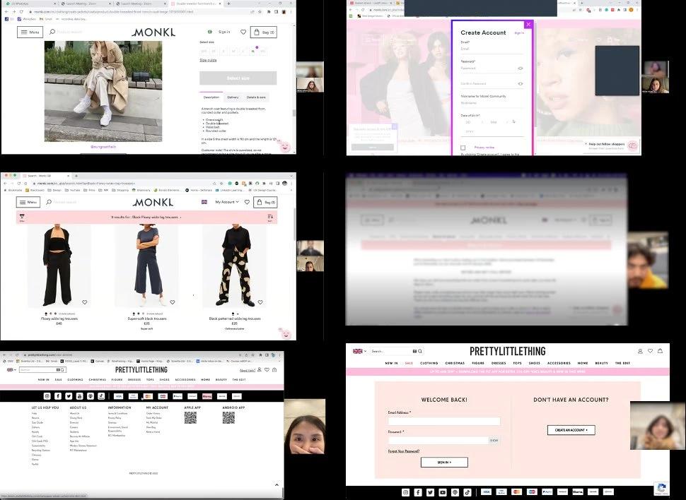
Five real people, recorded in session
| P | Age | Occupation | Shops | What they expected from the site |
|---|---|---|---|---|
| P1 | 31 | Employed | Online | Buy a gift for a friend on a female-oriented site |
| P2 | 23 | Student | Online | The best student discounts |
| P3 | 26 | Employed | In-store | An easy-to-use website |
| P4 | 28 | Employed | Online | Something easy and quick |
| P5 | 29 | Student | Online | The latest fashion trends |
The panel: recruited on gender, age and shopping habits. Two knew Monki beforehand.
The data
Monki wasn't slightly behind. It was in a different category.
Every one of eight metrics told the same story.
| Task | P1–P5 on Monki | Monki | PLT | What participants said |
|---|---|---|---|---|
| 1 · Account + reviewed product | ✗ ✗ ✓ ✗ ✓ | 40% | 100% | "There should have been a login from Gmail and Facebook." · P1 |
| 2 · Product + student discount | ✗ ✓ ✗ ✓ ✗ | 40% | 80% | "Even after creating an account, it still shows I need to sign up." · P2 |
| 3 · Boots + nearest store | ✗ ✗ ✗ ✓ ✗ | 20% | 100% | "I have never felt so stressed about shopping online." · P1 |
| 4 · Fit guide + refund policy | ✓ ✗ ✗ ✗ ✗ | 20% | 100% | "I expected the store locator on the product page, not the bottom." · P4 |
Per-participant completion on Monki with a verbatim per task. On PLT, 18 of 20 task runs succeeded.
What testing surfaced
Ten issues. Four critical. All commercial.
Every issue severity-graded, tied to a business risk, and paired with a recommendation the engineering team could scope.
| # | Issue | Priority | Recommendation | Status |
|---|---|---|---|---|
| 01 | Cluttered homepage layout | High | Standardised image grid, clear hierarchy | Implemented |
| 02 | No sign-up option on homepage | High | Separate Sign up / Sign in CTAs | Implemented |
| 03 | Store locator buried & unusable | Medium | Geolocation store finder on the product page | Recommended |
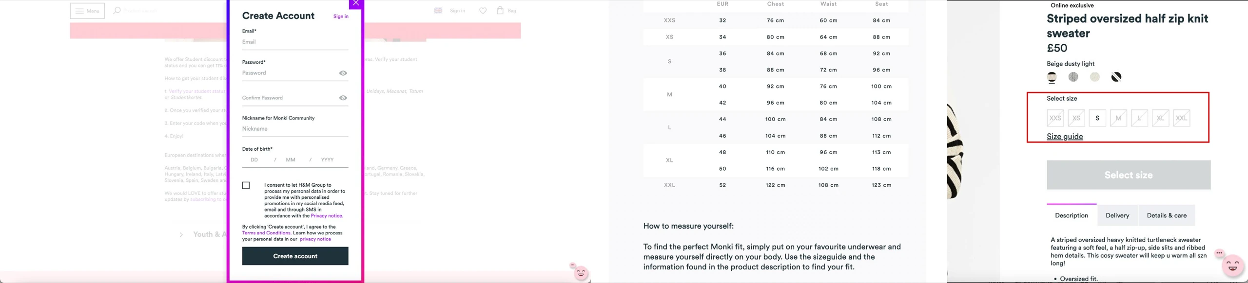
| 04 | Menu contrast: WCAG failure | High | High-contrast background for all menu states | Implemented |
| 05 | Reviews missing or read-only | Medium | Universal reviews with write & photo capability | Implemented |
| 06 | Delivery estimate: false information | Medium | Postcode-based delivery estimate on product page | Recommended |
| 07 | Student discount takes 10+ minutes | Medium | Direct Totum / UNiDAYS / Student Beans integration | Recommended |
| 08 | No social sign-in | High | Google / Facebook / Instagram OAuth login | Implemented |
| 09 | Size guide cm-only | Low | cm / inch converter in the fit guide | Recommended |
| 10 | Out-of-stock items sit in cart | Low | Reserve stock once it's in the cart | Recommended |
The full issue log, the single source of truth the roadmap and impact figures below refer to.
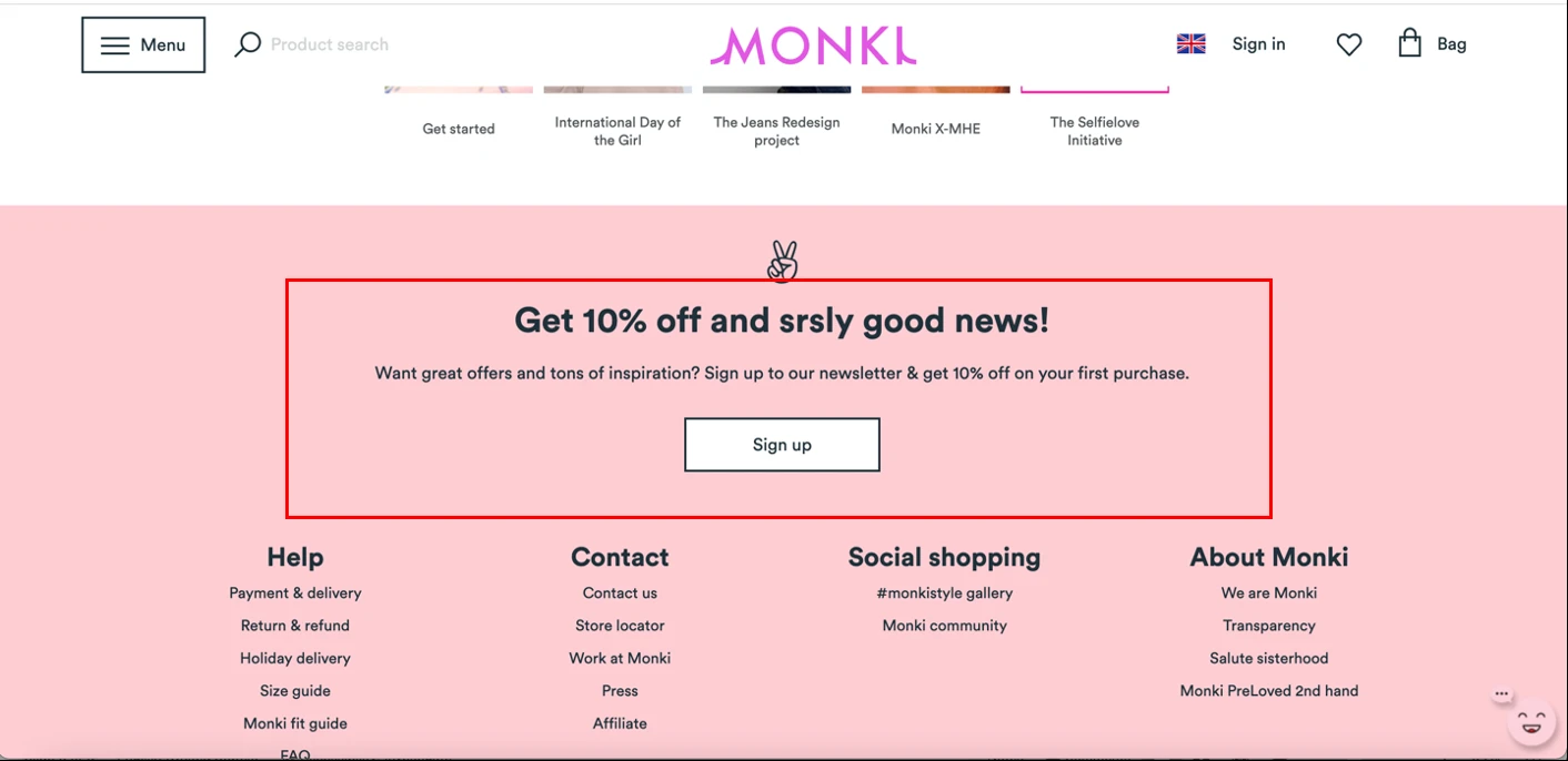
Sign-up hidden inside sign-in
Participants scrolled to the footer, joined the newsletter, and believed they had an account. Cost: every missed new customer.
“There should have been a login from Gmail and Facebook. It makes the signup process quicker. · P1”
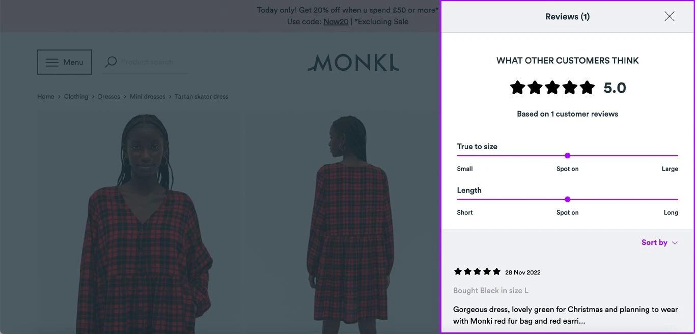
Reviews missing or read-only
Present on some products, absent on others, writable nowhere. Expert pilot: feels like a dropshipping site.
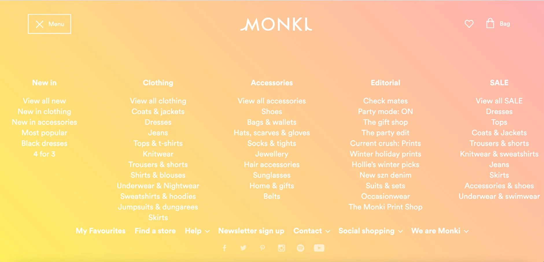
Menu contrast: WCAG failure
White type on a pastel gradient across the primary navigation. Legal exposure, not just friction.
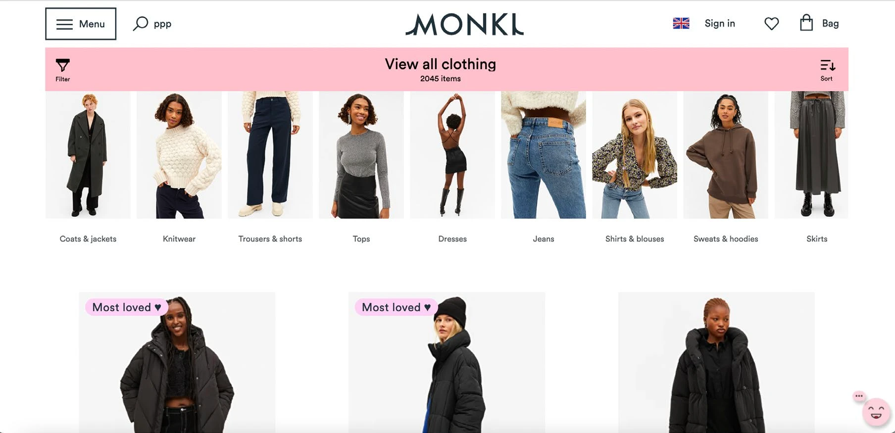
Cluttered, inconsistent homepage
Mixed image sizes, uneven placement: cognitive load working against the editorial brand.

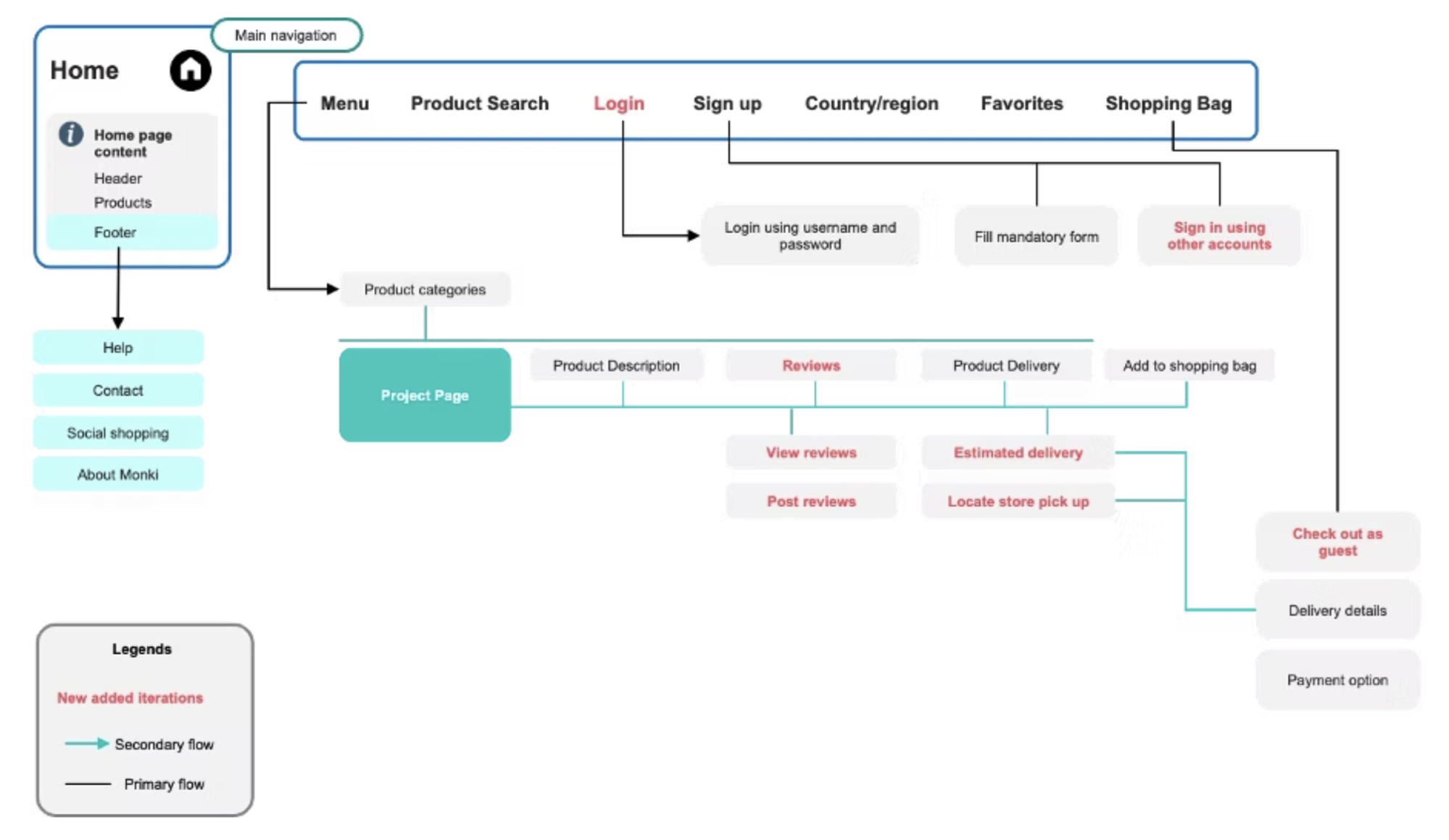
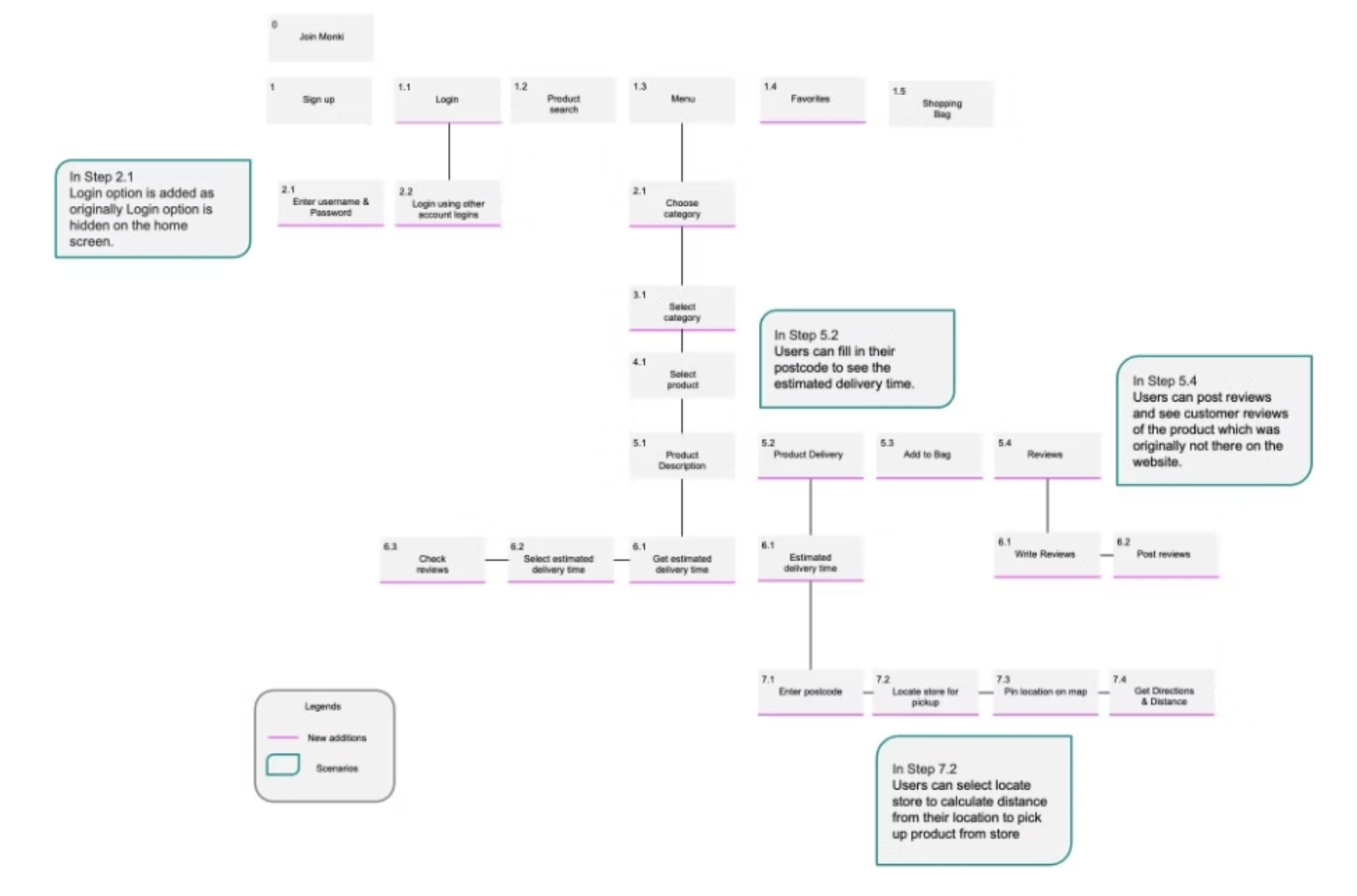
Where users expected it: card sort
- Reviews directly below the product description
- Store pickup on the product page
- Delivery estimate before add-to-cart
- Size guide next to the size selector
Where Monki put it
- Hidden behind a tab, or absent entirely
- Bottom of the page, behind a map interaction
- After checkout
- A separate page, in cm only
The card sort didn't just list problems. It pointed to a specific reorganisation. I reworked the site map and the core user flows so the surfaces users looked for (a visible login, reviews, a delivery estimate, store pickup) sat where they expected them.
“Users arrived at Monki already interested. The site's job was simply not to lose them. It was failing that job in ten specific, measurable, fixable ways.”
What happened next
A sequenced roadmap, and five fixes live
Sequenced by effort, impact and dependency, not a flat list.
High impact · Low effort: Do first
- Sign up / Sign in separation
- Navigation contrast (WCAG)
- Homepage image grid
- Social sign-in (OAuth)
High impact · High effort: Plan next
- Universal reviews system
- IA restructure: product page
- Student discount integration
- Postcode delivery estimate
Low impact · Low effort: Quick fills
- Size guide cm/inch converter
- Cart stock reservation
Low impact · High effort: Defer
- Store locator full redesign
- Click-and-collect infrastructure
Recommendations implemented by the client
The client moved on the high-priority phase immediately after delivery.
- Separate Sign up / Sign in CTAs: the highest-failure path in testing, removed.
- Navigation contrast fixed: WCAG compliance on the most visible surface.
- Universal reviews with write capability: the trust collapse addressed.
- Social sign-in (Google / Facebook): acquisition friction removed.
- Homepage grid standardised: first-impression cognitive load down.
Looking back
What the research taught me
PLT was a flawed comparator
A conversion machine vs a brand experience skews task-efficiency metrics. & Other Stories would have framed it more fairly, the findings hold, the framing sharpens.
The real gap was likely bigger
Think-aloud inflates completion. Monki lost badly even with that tailwind: a floor, not a ceiling, and worth caveating explicitly in the report.
Delivery isn't the finish line
Five recommendations shipped. Five didn't, and I never learned why. Next time the contract includes a post-delivery debrief with product and engineering.
Put the money in the document
Broken sign-up = lost acquisition. Missing reviews = suppressed conversion. I said it in the room, it belongs in writing, where executives decide.